Tihana Britvic
DATA ENGINEER
AZURE DATABRICKS
Azure Databricks is a fast, easy and collaborative Apache Spark-based analytics platform optimized for the Microsoft Azure cloud services platform. It enables the easy creation of Analytical and AI solutions. Azure Databricks supports Python, R, SQL, Scala, and Java, as well as data science frameworks and libraries such as Keras or TensorFlow.
ANALYTICS WITH AZURE DATABRICKS
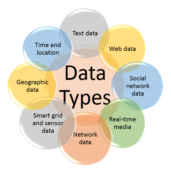
Big data analytics is a complex process of examining large and varied data sets. In practice, the data comes from the various sources and usually in a very wide range of data types which is why analytics platforms suited for the analysis of different data types become more and more popular with each day.
One of these platforms is Azure Databricks Service. How to set up an Azure Databricks Service and how to integrate it with Azure Data Factory has been described in the previous blog.
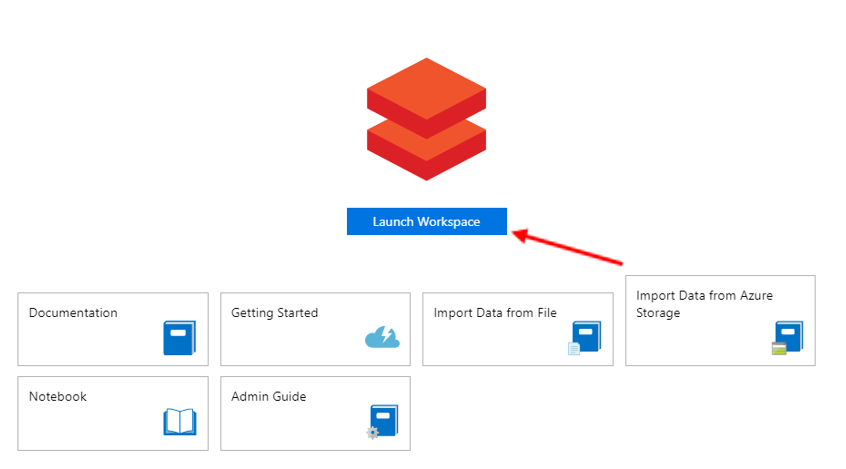
For a further demonstration, it is assumed that the Azure Databricks Service is set up and everything presented was done within the Azure Databricks workspace.
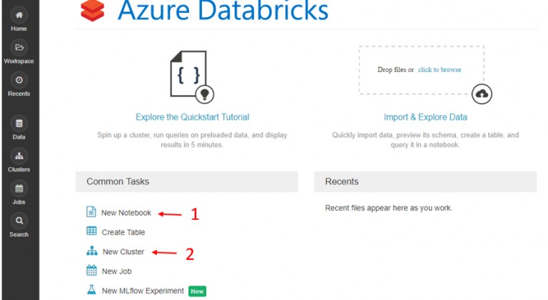
After the workspace has been created, choose to create a New cluster and a New Notebook among the Common tasks.
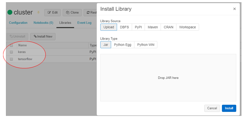
Attach the notebook to the created cluster and install needed libraries.
DATA
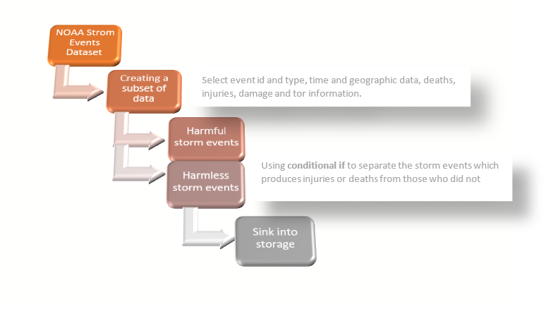
As same as in the previous blog, the data represents the events of storms happening across the USA collected by the National Oceanic and Atmospheric Administration whose available datasets can be found here. Using the Azure Data Factory, the Data Flow for splitting the data into the two distinct datasets was designed. The datasets were sunk in the Harmless and Harmful tables on the storage.
PYTHON NOTEBOOK
First, the data from the created tables Harmful.csv and Harmless.csv on storage will be loaded and Spark data frames will be created which enables a simple execution of the SQL queries.
To read from the storage the following spark commands were used:
spark.conf.set("fs.azure.account.key.synstoragev2.blob.core.windows.net", "1godsKDsghCPXligem+4/qi0Z8sX5yIROFMmdPY8E0XoFJ/YQqP5F37ohI5qdv15feQ9SdopnjoJ2uaI7BU07NA==")
harmless_df = spark.read.csv("wasbs://storm@synstoragev2.blob.core.windows.net/Harmless.csv", header="true")
After the data has been read and the data frame has been created, it is easy to display the data and to check our data flow result.
The data frame contains the following attributes: EVENT_ID, STATE, YEAR, MONTH_NAME, EVENT_TYPE, INJURIES_DIRECT, INJURIES_INDIRECT, DEATHS_DIRECT, DEATHS_INDIRECT, DAMAGE_PROPERTY, TOR_F_SCALE, TOR_LENGTH, and TOR_WIDTH.
For the simpler usage, the temporary tables destructive_storms and mild_storm from data frames were created with the following commands:
harmful_df.registerTempTable("destructive_storms")
harmless_df.registerTempTable("mild_storms")
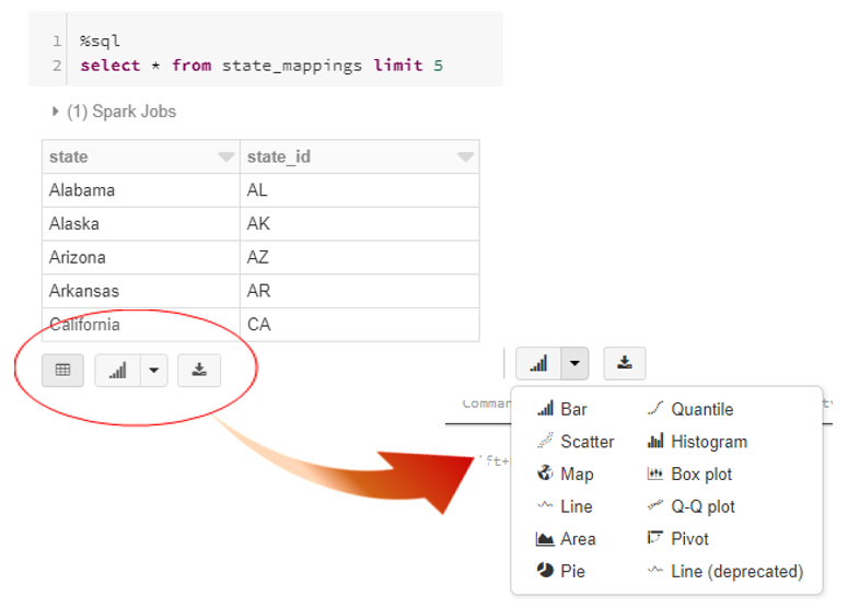
Since the data includes the names of United States, the ISO 3166-1 standard needs to be respected. Hence, the table state_mappings containing the names of the states and their ISO standard names was created.
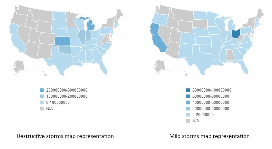
On the bottom of the result, click on the arrow next to Bar Chart icon which opens a variety of possible visual representation for the queried data. We will demonstrate the various possibilities in the further part of the blog. Choosing the Map type of graph, we were able to show damages caused by storms in US dollars.
If the scale is looked carefully, one can notice that the destructive storms produced the damages up to 300M USD while the mild storms produced the damages up to 100M USD which is not expected considering the destructive_storm table consists of the storm events which resulted with injuries and deaths, hence often results with bigger damage.
The second thing checked was the events with Tornado type of the storm. Sizes of the tor width and length were checked and taken into consideration. The states hit by the 10 biggest tornados were observed more closely. The states are listed below with the corresponding tor averages. One can also notice that the size of a tor does not necessarily correspond with the size of the damaged property. This can be seen in the picture below.
Similarly, by joining tables destructive_storm, mild_storm and state_mappings we displayed the total number of both destructive and mild storms per each state.
This is an excellent example of multiple data visualization. The same data, only for the five most hit countries, can also be represented by pie charts. Pie charts are interesting types of graphs since the number of different values per the same key will match the number of pie charts created.
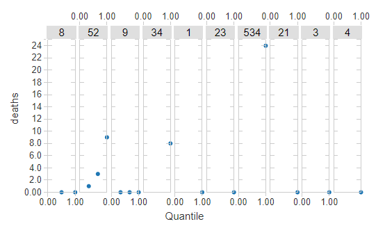
We were also able to calculate quantiles for the probability of deaths in case of an injury. Quantiles are cut points which divide the range of a probability distribution into continuous intervals with equal probabilities or simply divide the observations in the same way.
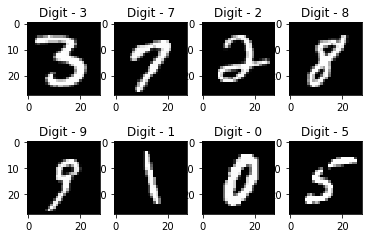
To test the Azure Databricks and all its possibilities, the recognition of handwritten digits was solved using only Python notebooks. Handwritten digit recognition gained popularity from the aspiring beginner of machine learning and deep learning to an expert and is often used to be tested on.
How to install libraries and packages in Azure Databricks Cluster is explained in the Analytics with Azure Databricks section. For this classification problem, Keras and TensorFlow must be installed.
The dataset can be found here, however, it is also a part of the dataset available in Keras and can be loaded using the following commands.
from keras.datasets import mnist
(x_train, y_train), (x_test, y_test) = mnist.load_data()
The entire code including several different solutions for this classification problem can be found in the Databricks documentation and example notebooks.
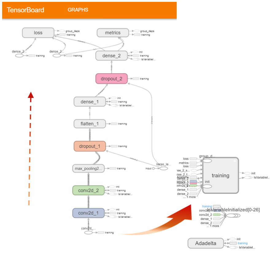
For a visual representation of model training, we will use TensorBoard which can be imported using the following command:
from keras.callbacks import TensorBoard
The TensorFlow directory must be defined for gaining a real-time visualization. This can be done with:
tb_dir = '/tmp/tensorflow_log_dir/{}'.format(time())
tensorboard = TensorBoard(log_dir = tb_dir)
dbutils.tensorboard.start(tb_dir)
The model was defined with:
model = Sequential()
model.add(Conv2D(32, kernel_size=(3, 3),
activation='relu',
input_shape=input_shape))
model.add(Conv2D(64, (3, 3), activation='relu'))
model.add(MaxPooling2D(pool_size=(2, 2)))
model.add(Dropout(0.25))
model.add(Flatten())
model.add(Dense(128, activation='relu'))
model.add(Dropout(0.5))
model.add(Dense(num_classes, activation='softmax'))
Finally, after the model has been defined it is time for training and testing.
model.fit(x_train, y_train, batch_size=batch_size, epochs=epochs, verbose=1, validation_data=(x_test, y_test), callbacks=[tensorboard])
We set the parameters batch_size on 128 and the number of epochs on 12, hence the visual representation is as follows.
Please visit the first part of the blog series:

